I have long been fascinated by the photography of David Maisel. Often, when people who don’t know much about fine-art photography joke around about what they think it is (can you guess?), I show them David’s website. Once they’re hooked to the beauty of the images, I tell them what they’re really looking at, and that never fails to work. However, I have always felt a little bit uncomfortable about admiring beautiful images of things that are quite disastrous, so I asked David whether he would talk about this with me.
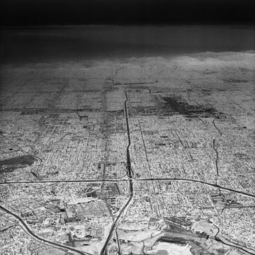
Jörg Colberg: For many of us, living conditions that don’t really support a worthwhile life seem to exist elsewhere. We see images taken in the new Chinese metropolises, say, and we feel like we’re peering into some other world. Michael Wolf’s photos of what he calls the “Architecture of Density” show huge apartment complexes, with large numbers of flats piled on top of each other. In a sense, when I look at your “Oblivion” series, I see the same thing, except that things aren’t on top of each other, they’re next to each other. And by casting it in an inverse black and white, it seems you have enhanced everything that is terrible about living that way. Can you tell me a little bit about your motivation behind the series? How easy was it to actually shoot the series, in the post 9/11 world?
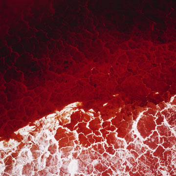
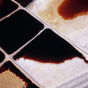
David Maisel: The “Oblivion” series came about as I reflected on an earlier body of work, “The Lake Project.” This earlier work focused on Owens Lake, which was diverted and drained beginning in 1913, in order to bring water to the desert city of Los Angeles. The site of Owens Lake subsequently became the largest source of particulate matter pollution in the United States, emitting some 300 million tons annually of microscopic particles of cadmium, chromium, aluminum, arsenic, and other minerals. I was curious- nearly a century after its destruction, what had the eradication of Owens Lake permitted to come into being? What was the aftermath of that decision?
Making photographs from the air over an urban environment in 2004 proved to be more difficult than I expected; to surveil and record the city from the air seemed nearly to approach an act of civil disobedience. Understandably perhaps, occupying that aerial position was fraught with difficulty, in the post 9-11 era. What I did not anticipate was that urban aerial images made at this point in history would, necessarily, have a different set of inherent meanings- that is, the aerial images in Oblivion describe a potentially desecrated urban fabric, even as they transcribe the commonplace. Chaos and catastrophe are now implicit in the urban aerial view. The images cannot help but serve as portent or prophesy of some future conflagration.
JC: What was it that made taking those photographs from the air so difficult? And if we are to consider those images as, as you say, a prophesy of some future disaster what are we to make of that?
DM: Well, the difficulty was in getting clearance from the FAA to fly over an urban area in order to make photographs. Ultimately, I was granted that clearance simply because the pilot I was working with had the necessary relationships in order to help make that happen.
I don’t know what the viewer should make of my notion that the urban aerial view is different now. Weapons have been launched at cities from the air for as long as the means have existed to do so. And airplanes have been used as weapons prior to 9/11. Maybe what is different now is our own sense of vulnerability- that such conflagrations can shatter, without warning, our daily existence. Maybe it just underscores for me the need or desire to have, or to create, a sanctuary in our daily lives.
JC: There are more aspects to the visual impact of “Oblivion”, I think. I keep coming back to those images, realizing yet another thing those photos remind me of. At times, they reminded me of those computer-generated images of military targets – imagery we are very familiar of since the military started to use them to give us clinical views of war. Or, “Oblivion” reminds me of the kinds of images you get to see when you use “Google Earth”. Was there any intention to create these kinds of similarities, or are they accidental?
DM: Yes, the idea of making surveillance images was on my mind as I began this project. But it was only once I had completed all of the aerial work, and was examining the negatives on my light table, that I realized that the negatives had a kind of chilling potency to them. I decided then to work with these images in negative, to transpose them tonally. It took quite some time for me to achieve what I wanted in that regard- almost a year of experimentation- and during that time I began to look more closely at sources such as military surveillance, night vision imagery, Google Earth and other contemporary forms of mapping, etc.

JC: I find it fascinating that the look and feel of surveillance and even military images – those greenish or grey-scale images seen from the cameras aboard missiles just before they hit something – have become so familiar. What kind of effect did you have in mind when you worked on getting the tonality of your images to their final form?
DM: I have been working on another series – not aerial, not landscape- that depicts copper canisters containing the cremated remains of patients from a psychiatric hospital, who remained unclaimed by their families. So, I was thinking about how we, how everything, shifts from one form to another- from human body to ash, from structure to non-structure. I realized that so much of my work – beginning with early work at the volcano Mount St Helens, through to this latest series of the copper canisters, called ‘Library of Dust’ – has been concerned with ash in some way or another.
When I looked at the negatives of Oblivion on the light table, the images looked like a city made of ash. So, I had that in mind. I also wanted to work with as limited a palette as possible- to make something devoid of color, where all the color has been bled out. Certainly I had all of those kinds of military images in mind. I considered bringing that greenish night-vision quality into the images, but it seemed unnecessary; the lack of color and the inversion of the tonalities were expressive enough.
Today I received an email from someone who called the images “prescient- it’s how I feel the world could look at any moment.”

JC: It’s almost like the images in “Terminal Mirage” or “The Lake Project” are the aesthetic opposite of those in “Oblivion”. Everything is just so beautiful! And then it takes a little while to realize that there’s something unreal about the images, especially those intense colours. Many of the photos show quite toxic environments. I would be curious to learn a little bit more about your motivations when shooting the images and when deciding how to present them. This kind of shock when the viewer realizes that there’s something behind the beauty – was that intended?
DM: Yes, it’s absolutely intentional. Years ago, when I began my project on open-pit mining in the American west, I was photographing exclusively in black-and-white. But, the colors at many of these sites were really so seductively gorgeous and so awful, simultaneously. I realized that the meaning and the potency of these sites was transmitted through that unearthly, magnificent color, and so I began to consciously work with that palette. The aerial view and the scale of these prints (up to 48”x48”) and the color combine to create a kind of ‘aesthetics of the sublime;’ there’s terror and beauty, combined.
On another level, I think there’s also a twinned process of seduction and betrayal involved- a viewer might be seduced by the colors and forms of these images, and then, in a sense, betrayed once knowledge of the subject becomes clear. It parallels the way we are seduced, and ultimately betrayed, by a certain level of consumerism that exacts such tolls on the environment. Yes, I want my SUV and my wide-screen TV and… oops! There goes the ozone layer! Imagine that!
JC: I always wonder, though, to what extent people really make that connection. You must have spoken to many people about their reactions when seeing the images. I’d be curious about the feedback that you got from them.
DM: The audience for my work- and for photography in general- is much wider and more sophisticated than it was when I started out on this path more than twenty years ago. In general, the people that go to the effort to talk to me about my work are among those who seem to understand the dichotomies and ambiguities that are present in the work. I don’t underestimate the abilities of viewers, to grasp these issues.
At the same time, I want the images to be able to exist as well on a purely visual level, without needing to know or to consider the subject matter that serves as their source. I don’t even think a viewer needs to understand that these are aerial images in order to gain something from the work. It is why I intentionally title my pieces without stating what it is a picture of, or where the photograph was taken.
JC: Despite its superficial appearance – the abstractness of “Terminal Mirage” or “Oblivion” – your work appears to be quite political or maybe activist. What’s the role an artist can play in our society? And isn’t there the danger that by making things too beautiful, some of the background might just disappear?
DM: Art has every need to address the political, and there is absolutely an intended political charge to these pictures. I don’t know that one can spend several decades photographing sites of environmental degradation without feeling at least somewhat politicized by the process. But in my work, I’m not interested in pointing fingers or laying blame. I feel that we as a society, collectively, have made these places. It isn’t as simple as condemning this or that corporation, for example.
I’m motivated by the notion of discovering and revealing sites that might otherwise remain unknown or unseen- be they clear-cut logging sites, strip mines, cyanide leaching fields, etc. My photographs of these sites are intended to be reflective of some sort of internal, psychological state as much as they are documents of a particular site. And, I consider myself a visual artist first and foremost- as opposed, perhaps, to a photojournalist or a documentarian. I’m most interested in making images that have a kind of depth-charge, that have a certain poetic or metaphoric impact visually.
It’s the overlapping realms of ethics and aesthetics that occupies my interest. So, there is a kind of “aesthetic activism” involved, I suppose.
Which provides a nice segue into your question about beauty, I’ll offer some thoughts. Beauty has been seen as problematic for the visual arts in general because we no longer trust beauty as a serious means of investigation. But it can be. Beauty wedges into artistic space a structure for continuously imagining what we do not yet know or understand. For an object or an image to possess beauty does not mean that it is empty of meaning or shallow. In fact, beauty can be incendiary. It can be subversive. It can make us cringe.
The kind of beauty that interests me most is one that possesses an element of terror- an awful beauty, beauty not as a salve, but as a weapon of sorts. It is an update, perhaps, of the nineteenth century notions of the sublime, which seems to have something relevant to say at our point in history right now. In his essay “Notes on Beauty,” the critic Peter Schjeldahl writes “Nothing in itself, beauty may be a mental solvent that dissolves something else, melting it into radiance.”